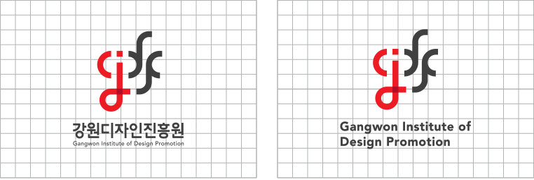
Symbol (CI)
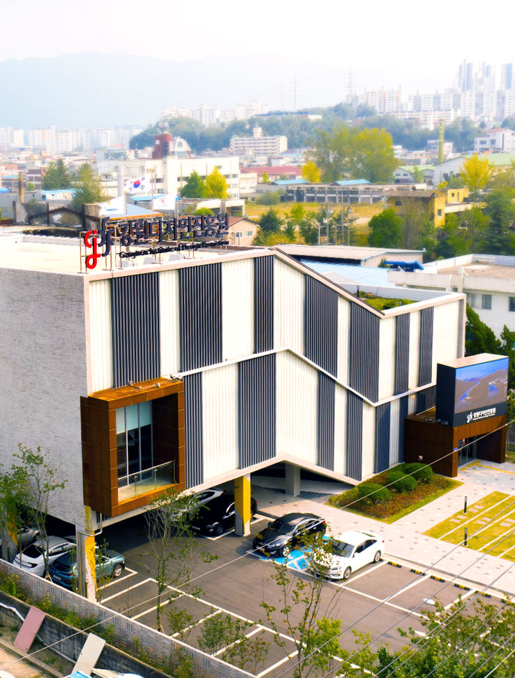
The Gangwon Institute of Design Promotion is an innovative institution dedicated to design policy/business that leads the promotion of Gangwon design.
With the harmony of soft, emotional curve and semicircle that is gradually filling, CI symbolizes the Gangwon Institute of Design Promotion, which aims to establish itself as a space of comfortable, friendly, and free communication and creation that is open to anyone.
Meaning of Each Component
Curve
Through a free, organic curve that gives a youthful, flexible, rhythmic, soft, and infinite feeling, the curve symbolizes the Gangwon Institute of Design Promotion, which will be the foundation for passionate and creative changes through infinite challenges and free thoughts as an open institution.
Color
By combining creative, passionate, and innovative red with courageous, elegant, and black that makes the surroundings stand out, the colors symbolize the open future of the Gangwon Institute of Design Promotion, which supports creators with strong passion, wisdom, youth, and thirst for challenge and who grow through convergence and innovation.
Word Mark
A combination of a symbol mark and a word mark, the design has visualized GIDP with semicircle and curve, using the red color of passion as point color to emphasize Gangwon’s initial “g.” The word mark represents the Gangwon Institute of Design Promotion, which grows through convergence and innovation.
Logo Guide
Hangul type
Korean horizontal type
English type
English horizontal type
Signature
Left and right-combined type
Colors
Main Color
-
GIDP Red
M100 + Y100
PANTONE RED 032 C
-
GIDP Charcoal
K90
PANTONE COOL GRAY 11 C
-
GIDP Rudy
M100 + Y81 + K30
PANTONE RED 187 C
Secondary color
-
GIDP Black
M100
-
GIDP Silver
PANTONE 877 C
-
GIDP Gold
PANTONE 874 C
Graphic Motifs
Main Color